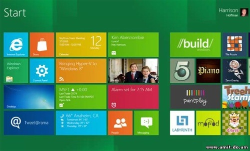
The OS X Dashboard is a bit of a mess, although one with potential. There are lots of possibilities, but it’s somewhat disorganized in its current iteration. Could this be tweaked in the upcoming Mountain Lion?
The opportunity there is for Apple and any application company to create widgets that can show various bits of information that can fit together into a cohesive tiled system for giving users quick, at-a-glance information. Mountain Lion’s alert system will be useful, but from what I can tell it doesn’t provide the level of general information that a full screen of live updates would.
I’ve not the time to create a mock-up of the idea, so you’ll have to use your imagination. But if you need a little help, use this image (yes, it’s Windows Tiles, so forgive me), but imagine it in the Dashboard.
The key seems to be using standardized sizes so that everything can fit together. Dashboard already has many widgets that do the very things that Windows Tiles do. However, they have too much “freedom” and aren’t designed to fit together.
Also, Apple could also adds smart folders to Dashboard — saved Spotlight searches. I was reading how a Windows Phone allows you to pin a feed of messages from a person on Faceback to the main screen. Pretty similar to a saved Spotlight search, eh?
These could be Dashboard widgets (one of the pre-set sizes so that they lock together well on the screen real estate). Extensions, of a sort, written by originating companies (e.g. Facebook, Twitter, etc.) or even third parties. This would allow us to create beautiful and informative screens full of information that would work on single screens via Spaces, and on multiple screens.
With some guidelines from Apple — and a little Dashboard window management — Mountain Lion could provide a system in which a user could design their own informational set-up.
— Dennis Sellers


