By Jay Nelson
I’ve used Pantone’s swatch books for more than 25 years, and I’m more excited about the new Pantone Plus Series (http://www.pantone.com) than any previous update to the Pantone Matching System.
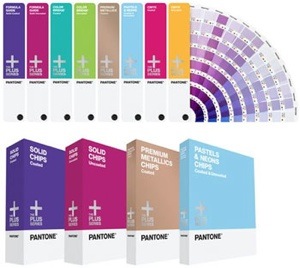
In previous updates, Pantone added new colors at the end of their swatch books, so finding all the colors in a particular range of hues meant navigating a complicated labyrinth of pages. The Plus Series arranges all the old and new colors together chromatically, including 566 new colors drawn from our current global marketplace. Among the new colors are 300 Premium Metallics and 56 Neons.
Pantone also added two new tools to the swatch books. At the end of each book is an index of colors by number that tells you the page and row where you’ll find each color. Also at the back is a swatch of color that lets you know if your current lighting conditions are suitable for judging color — if the top half isn’t identical to the bottom half, then the lighting is skewing the perception of color.
The swatch books are printed using current standards on coated and uncoated stock. Registering your swatch book online lets you download Pantone Color Manager software, which automatically updates your design software with the newest Pantone colors and provides unique tools to work with colors. The Color Manager works with the Adobe Creative Suite applications, QuarkXPress, and Corel software. (The Plus colors are already included with current versions of these apps so you can begin using them right away.)
The Plus Series replaces the Pantone Matching System but uses the same 14 Basic Color Inks. It complements Pantone’s Goe System and uses a new set of base inks.
Swatch books and chip books are available individually and in sets. If your work involves specifying colors, both you and your clients will enjoy the new colors in the Plus Series, which is priced at US$69 and up.
Rating: 10 out of 10
(This review is brought to you courtesy of “Layers Magazine”: http://layersmagazine.com/).